

A paint color that looks balanced on a small chip can seem unexpectedly cool, yellow, or vivid once it covers a full wall. In Austin, shifting daylight, strong afternoon sun, and surrounding materials such as limestone and brick can make that difference especially noticeable.
The answer is not simply to choose a different color. It is to evaluate the color in the light and setting where you will actually see it. Before committing to an interior palette or exterior scheme, consider the room’s orientation, fixed finishes, LED lighting, and paint sheen.
Why Austin light changes how paint reads
Paint does not appear in isolation. The light reaching a surface, and the light reflected back from nearby materials, affects how its undertones look.
A west-facing glass wall may bring in intense, warm afternoon light. Pale walls can look brighter and warmer at that time than they do in the morning. Limestone, brick, wood floors, and even landscaping can also cast reflected color onto nearby walls. In a home with expansive windows, these shifts can be substantial.
That is why a color selected under store lighting or judged by a small paper chip may not match your expectations at home. For a luxury home painting project in Austin, evaluate samples against your home’s actual light and finishes.
Start with undertones, not color names
A color’s undertone is the subtle hue that appears beneath its main impression. Two whites may both look “clean,” for example, while one leans cream or yellow and another leans blue or gray. The same is true of greys, greens, and blues.
Look at a sample beside the materials that will remain in the room: stone, flooring, cabinetry, tile, and large furnishings. A cool white beside warm Austin limestone can make the stone appear more yellow by contrast. A warm white may connect the finishes more naturally, but only a sample in your home can confirm the effect.

Whites and greys
Warm whites and greiges often complement cream or gold notes in limestone, brick, and wood. Cooler whites and blue-based greys can feel crisp beside cooler stone, metal, or contemporary finishes. In a dim room, a grey with a strong blue or violet undertone may look colder than expected.
Greens and blues
Muted greens can pick up yellow or grey influences from surrounding stone and foliage. Blues can shift between soft and airy in one light and more saturated in another. Before selecting a color for a large room or connected open-plan space, check whether it remains comfortable through the hours you use the room.
Room-by-room: orientation makes a difference
The same paint color can appear different on separate walls, or in rooms with different window orientations. The Sherwin-Williams guide to choosing paint colors by room orientation offers a useful starting point, but your own samples are the final test.
North-facing rooms
North-facing rooms tend to receive less direct sun and cooler-looking daylight. Warm whites, soft beige, and light warm greige can help prevent the space from feeling stark. Test cool greys and blue-based whites carefully; their cooler undertones may become more apparent.
South-facing rooms
South-facing rooms typically receive more consistent daylight. Many colors can work well, but bright light can make pale colors look lighter and stronger colors more vivid. If a warm cream or pink-beige already feels intense on a sample, it may feel more pronounced across the room.
West-facing rooms and glass walls
West-facing rooms often experience a noticeable shift: calmer light earlier in the day, followed by stronger, warmer afternoon sun. If you use the room throughout the day, choose a balanced color and assess it late in the afternoon. This is especially important for expansive glass walls, where direct light can brighten both the painted surface and nearby finishes.
East-facing rooms
East-facing rooms receive warmer morning light and generally cooler light later in the day. If you spend most of your time there in the morning, prioritize how the color looks then. If the room is used more at night, test it under the lamps you plan to use.
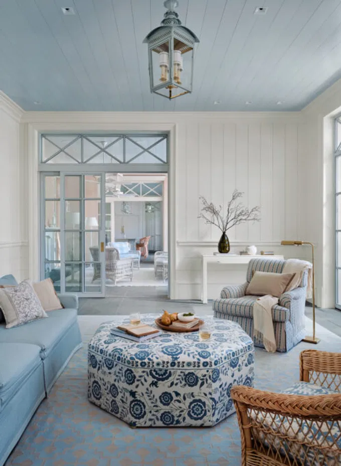
Don’t overlook LED color temperature
After sunset, the bulbs in your home become the main light source. LED color temperature is measured in kelvins (K): lower numbers tend to look warmer, while higher numbers tend to look cooler. A warm 2700K bulb can make a white or cream appear more yellow; a cooler bulb can emphasize blue or green undertones.
Check samples under the actual bulbs installed in the room, not only under daylight. If a room has multiple fixture types, compare the sample under each. Consistency across a space can help the paint and furnishings feel more cohesive.
Exterior colors need to work with the whole facade
Exterior color selection involves more than choosing a body color. Consider the home’s limestone, brick, roof, windows, paving, and neighboring landscape. A color that coordinates with one elevation may look different on another because each facade receives a different amount and quality of sunlight.
On large exterior surfaces, colors can seem lighter or more vivid than they did on a small chip. Test the body, trim, and accent colors on large samples beside the actual masonry, then view them both close up and from the street. Check the west-facing elevation in late-afternoon light, especially if it has broad windows or pale stone nearby.

Why large samples beat tiny chips
A small chip is useful for narrowing down options, but it cannot show how a color will look across an entire wall or facade. Large samples give you more surface area to assess undertones, contrast, and the effect of surrounding light.
BLS Painting’s sample-selection guide explains the use of portable boards to compare colors in different rooms and lighting conditions.
For a careful evaluation:
- Use a large, two-coat sample on a board or suitable test area.
- Place it near the room’s fixed finishes and on more than one wall when exposures differ.
- Review it in the morning, midday, late afternoon, and evening.
- Check it under the room’s LED bulbs after dark.
- For exterior colors, compare the sample with the masonry and look at it from a distance.
How sheen can change the impression
Sheen does not change a paint formula’s undertone, but it changes how light reflects off the surface. A matte finish tends to diffuse light and can make color appear softer. A higher-sheen finish reflects more light, creating visible highlights that may make color feel brighter or more pronounced, particularly in strong sun or beside large windows.
Evaluate a sample in the sheen planned for the project whenever possible. Comparing a matte sample with a higher-sheen finish can give you a misleading impression of the final color.
A more confident color decision with BLS Painting
Selecting the right color is a practical part of planning your project. Erick Luna, Vice President and Senior Project Manager, helps homeowners consider the surfaces, exposures, and finish details that affect how paint will look in place.
- Skilled craftsmanship: Your selected colors receive the careful preparation and application needed for a refined finish.
- Tailored guidance: You can assess options in the context of your home’s materials, lighting, and priorities.
- Clear communication: You know what to expect as color choices and project details are reviewed.
- Local experience: Our family-owned team has served Austin homeowners since 1995.
If you are planning a project with interior painters in Austin, take time to test the colors in your home before work begins. Get an Estimate or contact BLS Painting to discuss your home and next steps.
Frequently asked questions
Why does my white paint look yellow in the afternoon?
Warm afternoon sunlight, warm LED bulbs, and nearby materials can make yellow or cream undertones more noticeable. Check the sample at different times of day and under your installed lighting.
Should I test paint on every wall?
Test on walls with different exposures, especially when a room has windows facing different directions. A large movable board makes it easier to compare areas without committing to multiple painted patches.
Will a higher sheen make the paint color look different?
It can change the way the color appears by reflecting more light and creating stronger highlights. Compare samples in the finish planned for your project.
How can I choose an exterior color that works with limestone or brick?
Test large samples directly beside the home’s masonry, trim, roof, and other permanent finishes. Review them in different light and from the distance where the whole facade is visible.
BLS Painting is Austin's Painting Contractor for Luxury Residences:
We proudly service the elite neighborhoods of Old Enfield, Tarrytown, Barton Creek, Pemberton Heights, and Spanish Oaks. Our expert crews also provide luxury estate services in Westlake, Rollingwood, Lakeway, Bee Caves, Driftwood, Dripping Springs, Spicewood, and Buda, as well as other premier residential areas surrounding Austin, Texas.
Leave a Reply